A Beginner's Guide to Tailwind CSS
Understanding Tailwind CSS, its installation, and using its utility classes to create a simple grid section.
Introduction
When building a large project, you usually have multiple lines of HTML code, this results in an even lengthier style sheet. Most styles are going to be repetitive and this breaks the Don't Repeat Yourself (DRY) principle. Imagine you had classes that could help shorten your lines of CSS code and also make you develop faster. Won't that be amazing ?🤩 That's where Tailwind comes in.
It is possible to get these classes from Tailwind, so you don't have to write your custom styles. This article will introduce us to CSS frameworks and focus on Tailwind CSS, including how to install it and understand its key principles. We will use it to build a simple grid section to demonstrate how it works.
Take my hand 👫 as we embark on this amazing experience together. Buckle up, this is going to be an adventurous ride.
Prerequisites
Acquiring knowledge of a CSS framework requires that you already have a solid foundation of CSS (I mean, you can't use tailwind CSS effectively if you don't understand CSS 😅 ). Below are other requirements for this study;
Node.js installed on your PC. You can follow this link if you don't.
A big bright smile.😊
And that's it, we are ready for lift-off. 🚀
WHAT ARE CSS FRAMEWORKS?
CSS frameworks are predefined blocks of reusable code written in CSS syntax for styling a web page. We can say that they are CSS codes that have been written to be used by several places without rewriting the same code.
We can view a framework as a storage location that has prewritten code stored for future use. Let's say we want to style a button and the styles for that button would be used in several parts of our webpage. Instead of writing the code from scratch, we can go to the storage location (framework), select the code used for styling buttons, and use that code for our button.
There are several pieces of code for styling different parts of a webpage contained in frameworks e.g. navbars, cards, colors, etc. Therefore, using a framework in your project leads to faster completion. There are several CSS frameworks available, below is a list of the 5 most popular CSS frameworks in no particular order.
Tailwind CSS
Bootstrap
Materialize
Bulma
Foundation
In this article, we are interested in Tailwind CSS. Let's dive deep into it 🏊.
WHAT IS TAILWIND CSS?
This is a highly customizable, utility-first, beginner-friendly CSS framework, that enables developers to build beautiful designs without leaving their HTML page. Utility-first means that Tailwind classes carry out specific tasks and they are not predefined components that cannot be customized. That means, a class called flex in Tailwind simply means display: flex in plain CSS and nothing more.
Tailwind allows developers to build any design with the help of low-level classes. These classes are very easy to understand, as their naming conventions are very specific to their use, making them very beginner friendly. 😇
Tailwind classes are highly customizable. You can tweak the classes to your standards for your design. It is very flexible and very easy to make any change to your style. With its mobile-first approach, it makes building responsive sites relatively easy by eliminating the need for numerous media query breakpoints.
WHY TAILWIND CSS?
At this point, we know Tailwind is a great tool to use in our project regardless of size, but that's not all. Using Tailwind can give us a whole lot of other benefits. Below are 3 advantages of using Tailwind CSS.
(1) Speed of development
Using Tailwind's utility classes, we need not worry about naming conventions, and context switching between HTML and CSS files. They are relatively easy to customize as well, making the development process more efficient.
We can build large projects faster with the use of Tailwind as compared to using other frameworks and writing custom classes.
(2) Customization
In Tailwind, customization is very easy. You can easily override its default configuration with a tailwind.config.js file in your project. This file is gotten during the installation of Tailwind and customizing it is straightforward.
Everything ranging from screen sizes to colors and font family can be customized with ease using the Tailwind configuration file.
(3) Specific class names
One major struggle for beginners using CSS is naming classes. You are constantly thinking of what class name would be specific or generic. Using Tailwind eliminates this problem as the classes are very specific to their function. Most times you could guess the name of a class without looking at the tailwind documentation.
Using Tailwind reduces the number of times you have to create custom classes and this solves the problem of naming classes.
That's enough talk, 🤫 we know what Tailwind is, and why it is awesome, let's solidify our knowledge by installing Tailwind and using these utility classes, to create a simple grid section. Get ready, here comes the sweet stuff. 😁
INSTALLING TAILWIND CSS
There are 4 ways of installing Tailwind, but we'll use the Tailwind command line interface approach, this is the fastest way of getting Tailwind from scratch. Let's get into it.
Step 1
Install tailwind via node packet manager(npm) - a large registry for software packages. Open your command line, navigate to the location of your project and use the code below to install it.
NOTE:
Before using any npm package, we must initialize npm into our project, the result of doing this is a package.json file. We will use the command below to initialize npm;
npm init
You'll get a prompt asking for details of the project, like the author (which is you), a git repository, etc., we'll skip them and complete the prompt. With that, you are set to install Tailwind.
Let's use the command below to install Tailwind.
npm install -D tailwindcss
This command will download a node_modules folder, containing all the files for using Tailwind in your project, and also adds a package-lock.json file.
Step 2
Create your tailwind configuration file. We will use the command below for that.
npx tailwindcss init
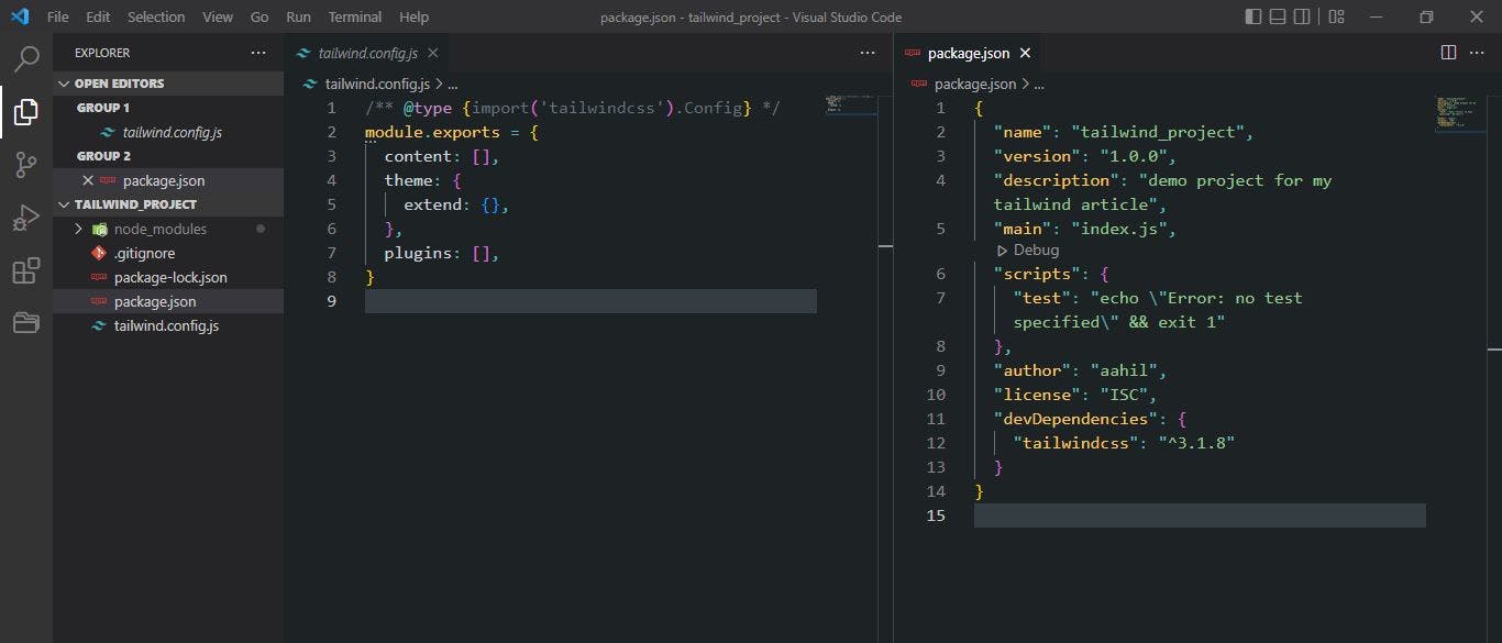
The tailwind.config.js file is used to define all your customized styles. If nothing is specified in this file, you will be using the default styles as specified by Tailwind. You can customize a lot of styles here, some include colors, screen sizes, font family, etc.
At this point, your folder should look like this. 👇
Step 3
Configure our template paths. In the tailwind.config.js file, we have to configure all files that contain tailwind class names. Tailwind needs this information because it scans through those files to generate the corresponding styles for those utility classes.
This configuration happens in the contents section of your configuration file. Let's get into it.
- Navigate to the configuration file.
- Go to the contents section and add the paths to all your files that will contain utility classes. In my case, I will add the path to my HTML file, but you can also add the path to your JavaScript file.
This will scan through all the HTML files in my project and look for Tailwind utility classes.
Step 4
Create our main CSS file. Inside this file, we will add Tailwind directives, these directives offer special functionalities to our Tailwind project. They are special Tailwind at-rules(@) that we can use in our CSS. Examples of tailwind directives are @apply, @tailwind, and @layer, but more about each of them later.
We'll create a src folder, add our CSS file there and add the following Tailwind directives. See below;
@tailwind base;
@tailwind components;
@tailwind utilities;
Step 5
Start the build process. We have to compile the Tailwind file and have it constantly updated whenever we add new utility classes. In the build process, Tailwind scans the HTML file and any other static file paths we set in our configuration file to find utility classes, then generates the CSS styles for those classes.
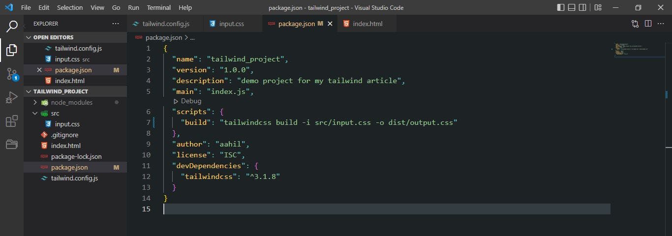
Starting the build process requires a command and there are two ways of executing this command. We can either do it in the command line or add it to our package.json file. We'll use the package.json approach.
- Navigate to the
package.jsonfile, inside the scripts section and add the code below;
"build": "tailwindcss -i src/input.css -o dist/output.css"
This command builds Tailwind from our main CSS file(input.css) and compiles it in the output CSS file(output.css). The output file is the CSS file we will attach to our HTML.
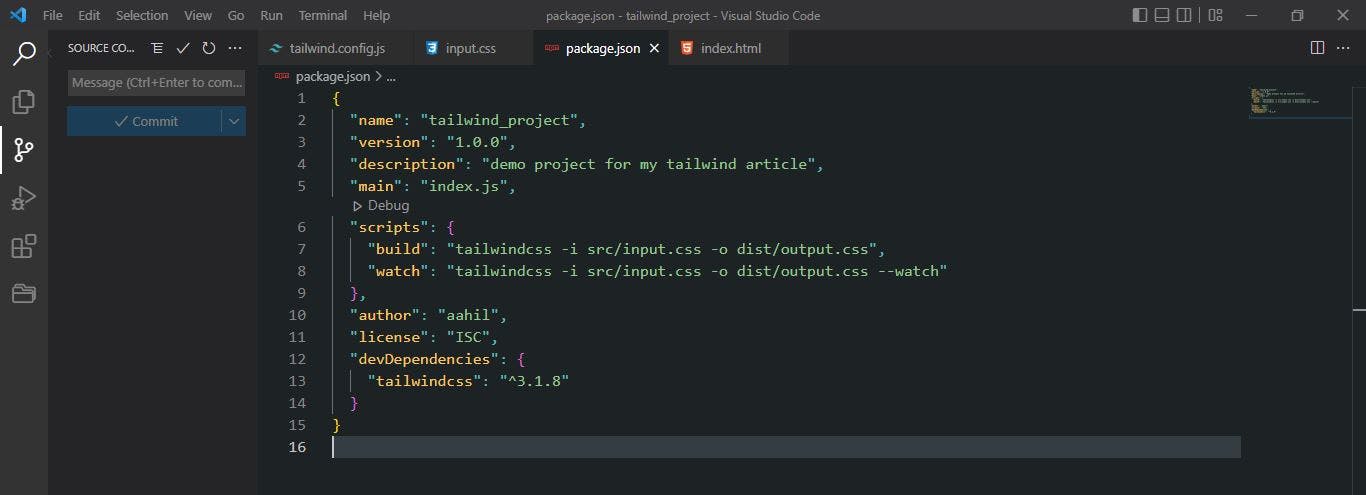
- Add the
watchcommand to the scripts section.
The watch command constantly updates the output file. It looks for any changes made and builds the CSS again. Immediately after the build command, you add the watch command.
"watch": "tailwindcss -i src/input.css -o dist/output.css --watch"
- Run the command
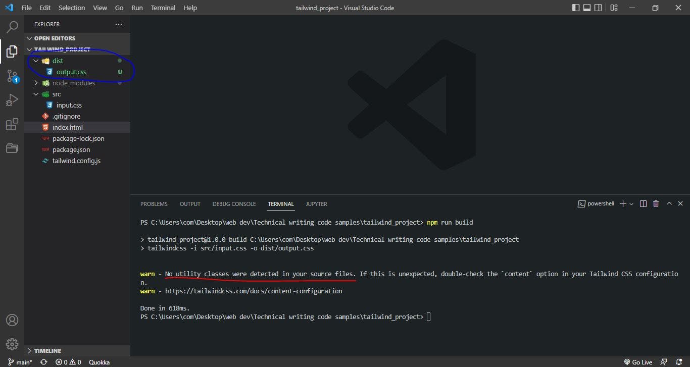
We'll go to our command line and run the command npm run build which will build our styles for us.
It created a distribution folder dist for us, with an output.css file in it. The content of the output.css file is compiled styles from our input.css file. This is the file we'll link to our HTML because all styles will be compiled and stored in this file.
If we take a look at our command line result, it says that Tailwind didn't find any Utility classes. That is because we don't have any Utility classes in our HTML yet.
We are done with setting up Tailwind for our project, 💃😀 this is when we begin our grid section project. Let's go!! 🚀
A SIMPLE GRID SECTION PROJECT
There is no better way to learn than to use the newly acquired knowledge to practice. Over the next few sections, we will build a beautiful grid section to solidify the knowledge we have on Tailwind and explain some key elements necessary in its application.
This is the demo of what we'll be building.
Let's begin !!🚀
(1) Link the output.css file in your HTML
As earlier stated, the output.css file will be the main stylesheet for our project as all the utility classes will be compiled into it. We'll use the code below to link it to our HTML.
<link rel="stylesheet" href="./dist/output.css">
(2) Create grid skeleton
We'll create a div and add Tailwind's utility class of grid, this will make the display of the div to be a grid. See this below 👇
<div class="grid grid-cols-2 grid-rows-3">

</div>
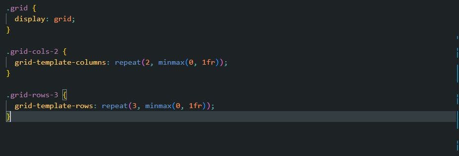
The following Tailwind classes mean the following in plain CSS;
The grid class means {display: grid}
The grid-cols-2 means .grid-cols-2 {
grid-template-columns: repeat(2, minmax(0, 1fr));
}
The grid-rows-3 means .grid-rows-3 {
grid-template-rows: repeat(3, minmax(0, 1fr));
}
If we observe, we are building our grid section ourselves with the help of the utility classes. If we want to specify any change at all, there is a utility class for it, we just have to check the official Tailwind documentation.
Currently, we have to rebuild our files to see the changes made, but instead of running the npm run build command every time we make a change, we will use the npm run watch command. Remember, we added the watch section to our scripts in our package.json file during installation, all we have to do is run it. This will watch for any changes and build our CSS for us.
Go to your command line interface, and copy the command below to build our new changes. We'll notice that new changes have been added to our output.css file.
npm run watch
Take note, that every time a change is made, Tailwind will rebuild our CSS for us. See below👇
If we check our output file, we will see that Tailwind has scanned through the paths we specified, which is the HTML, converting all the utility classes to plain CSS and storing them there. We can confirm by scrolling to the bottom of the output CSS file. See below 👇.
Before we complete our grid, one useful resource that will assist us in building this project is the Tailwind extension. It will assist us in completing class names and on hover, it will show us the meaning of the utility class in plain CSS. It is available for those using vs code IDE for development. You can get it here.
(3) Let's add the content of our grid.
The main grid section contains 6 div with different colors. Let's add them now.
        <div></div>
        <div></div>
        <div></div>
        <div></div>
        <div></div>
        <div></div>
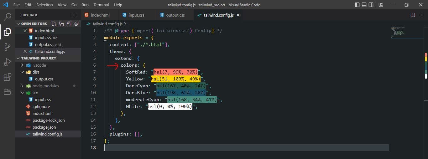
This is just the skeleton of the boxes, it does nothing yet, we will add the background colors and some generic styles to them. To do this, we will go to our configuration file, add the different color codes we will be using, and reference those colors in the HTML. To do this, follow the steps below;
- Under the
extendsobject in the config file, create another object calledcolorsand add the colors in a key-value pattern.
extend: {
      colors: {
        SoftRed: "hsl(7, 99%, 70%)",
        Yellow: "hsl(51, 100%, 49%)",
        DarkCyan: "hsl(167, 40%, 24%)",
        DarkBlue: "hsl(198, 62%, 26%)",
        moderateCyan: "hsl(168, 34%, 41%)",
        White: "hsl(0, 0%, 100%)",
      }
See my code below;
- Go to your HTML, and add a reference to the colors for each div.
        <div class="bg-White"></div>
        <div class="bg-Yellow"></div>
        <div class="bg-DarkCyan"></div>
        <div class="bg-DarkBlue"></div>
        <div class="bg-moderateCyan"></div>
        <div class="bg-SoftRed"></div>
To add colors in Tailwind, the prefix 'bg' which stands for background, is appended to each color. Currently, nothing is displayed on our webpage because we've not set any width or height for the boxes. Let's do that now.
w-full h-60
The classes above specify width and height respectively. We'll add this code to all the boxes and watch the magic.
Yes!, we just created our grid. The last feature to implement is adding the texts and images. This is a challenge for you to attempt, you can submit a link to your project in the comments section.
Our code is working very well but there is one small thing we have to refactor. Tailwind allows us to write utility classes in our HTML and this is very cool, but they can become very long, making our HTML look rowdy. This is an ugly situation, but there is a solution to this problem.
We can give our different elements custom class names and still apply Tailwind's utility classes to them. We can do this with the help of Tailwind directives and our input.css file. Let's get into it.
TAILWIND DIRECTIVES (@)
As defined earlier, directives are special at-rules that offer functionalities to our Tailwind project. The 3 types of directives in Tailwind are @apply, @tailwind, and @layer. Let's dive deep into their meanings.
The @apply directive
This directive is used when we want to use utility classes on custom classes. You define the class, then use @apply followed by the utility classes. We'll use this to refactor our code later.
The @layer directive
This directive is used to tell Tailwind, 'Hey, this custom class belongs to this particular ' bucket' '. By bucket, we mean either the base, component, or utilities. We'll see them in practice very soon.
The @tailwind directive
This directive adds Tailwinds base, component, or utilities styles into our CSS. That means, for the base layer, we will be adding Tailwinds base styles to our CSS. An example of a base style can be a heading(h1 - h6) etc.
We know what directives are, let's refactor our HTML, and take all our utility classes to our input.css file. Let's go!🚀
- Add custom classes to our HTML
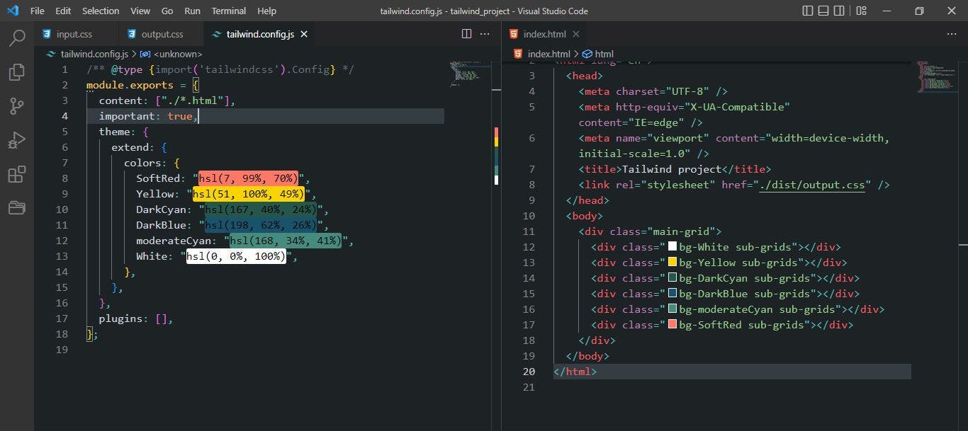
We are moving all the inline utility classes from HTML to our CSS file, this will require a custom class that will hold all the utility classes in the CSS file. Therefore, we will copy the inline style, add a custom class and go to our CSS and paste the utility classes into our CSS file. Let's do it now.
    <div class="main-grid">
      <div class="bg-White sub-grids"></div>
      <div class="bg-Yellow sub-grids"></div>
      <div class="bg-DarkCyan sub-grids"></div>
      <div class="bg-DarkBlue sub-grids"></div>
      <div class="bg-moderateCyan sub-grids"></div>
      <div class="bg-SoftRed sub-grids"></div>
    </div>
The new HTML document looks like this. We removed the utility classes for the grid container and gave it a class name of main-grid and the boxes we gave a class of sub-grids. We'll add the utility classes in the input.css file
@layer utilities {
  .main-grid {
    @apply grid grid-cols-2 grid-rows-3;
  }
  .sub-grids {
    @apply w-full h-60;
  }
}
This is what our CSS looks like. We simply told Tailwind 'Hey, add the main-grid and sub-grids classes into the utility layer then apply their respective utility classes'. We just set our custom classes to contain Tailwinds utility classes this is pretty amazing 🤩.
We can also try out the base layer and apply a style to our body tag.
@layer base {
  body {
    @apply m-4;
  }
}
Here, we set the margin of the body to 1rem. The goal of refactoring our HTML is that it should look very neat now. Check it out.
This grid section was extracted from one of my projects. You can get the complete version from my github.
Conclusion
In this article, I introduced you to the amazing world of CSS frameworks using Tailwind CSS as a case study. Using a framework as good as Tailwind will double your production speed regardless of the size of your project. The fundamentals of using this framework have been elaborated here, but there's still much more to it, which is why it is advisable to have the documentation close by when building, to refer to it for class names or any conflicting issues.
We know how to carry out Tailwind installation from scratch, what terms like directives and utility classes mean, and used our knowledge in designing a grid section. That is good progress, thank you so much for sticking to the end. It was very long, but I'm sure we had a good time. Thank you for trusting me with your time, enjoy your newly acquired skill. 😎🥂

