

Tristate Toggle Switch Theme using JavaScript
Utilizing HTML, CSS, and JavaScript to create your own three-themed toggle switch.


A common feature of any application or website is the dark/light mode, and in this article, we will build a toggle switch with three switchable themes.
This will be a step-by-step guide in which we'll build a toggled switch around a calculator project - don't worry, we're not building an actual calculator, so don't get scared; it's just going to be a calculator that features a toggle switch, which isn't too complicated.
Prerequisite
- Basic knowledge of HTML and CSS.
- Very basic knowledge of JavaScript.
- Understanding how to create a toggle switch. (You can learn how to do it here.)
High-Level overview of the implementation.
The project idea came from Frontend Mentors - a website where frontend developers can find projects, implement them, and submit the results back for critique. (Check them out at Frontend mentors) The original project is a calculator with three different themes.
Basically, we will be using DOM manipulation in javaScript for implementing this feature, so in our script, we will be selecting classes and switching between them, let's get started.😃💃
HTML Markup
To create this feature, we will have the following HTML Markup;
A navigation bar as the parent node that contains the following;
- A div with the class of 'logo-box' for the logo.
- A div with the class of 'toggle-section' for the switch.
The toggle section as a child node of the navigation bar will contain the following;
- A div with the class of 'left-toggle'.
- A div with the class of 'toggle'.
The div with the class of 'toggle' is where the switch will be located and it will contain the following;
- A div with the class of 'toggle-btns' containing 3
ptags with each containing the numbers 1, 2, and 3 respectively. - A div with the class of 'switch' that has a child div with the class of 'ball'.
see the code snippet below 👇
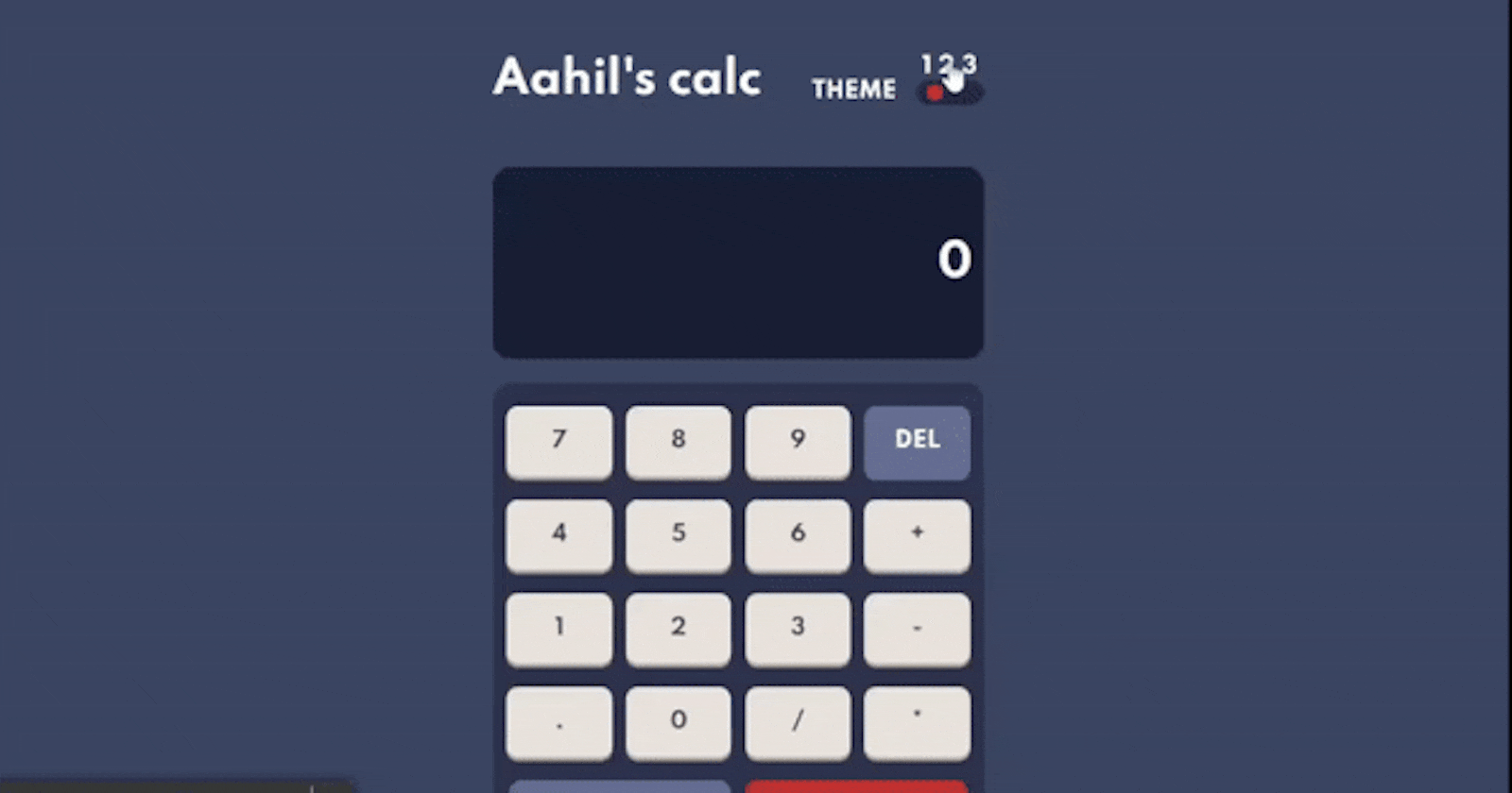
  <nav>
    <div class="logo-box">
      <h1>Aahil's calc</h1>
    </div>
    <div class="toggle-section">
      <div class="left-toggle">
        <p>THEME</p>
      </div>
      <div class="toggle">
        <div class="toggle-btns">
            <p class="toggle-btn1">1</p>
            <p class="toggle-btn2">2</p>
            <p class="toggle-btn3">3</p>
        </div>
        <div class="switch">
            <div class="ball"></div>
        </div>
     </div>
    </div>
  </nav>
Output👇
For simplicity, that is all the HTML we'll need for our implementation. The concept is that the toggle represents what we click to result in a change while the other content is the entire webpage.
CSS Markup
In this section, we will add styles to the markup because the styles added here will be the default mode on the website or application.
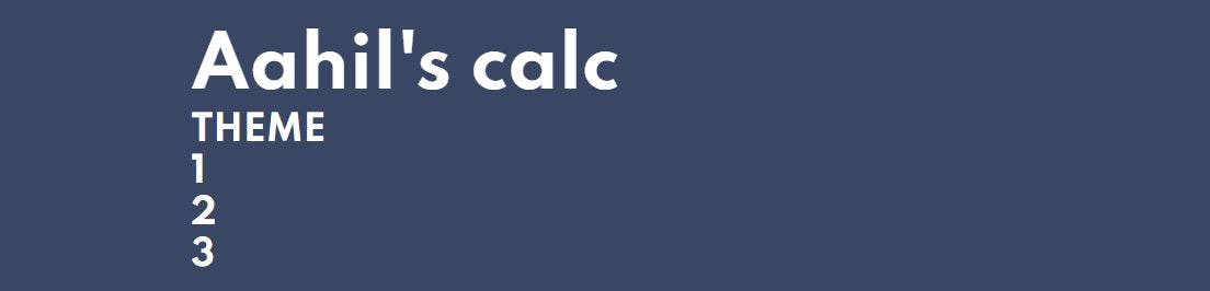
Let's start with the entire background style. 🙂
body{
    font-size: 16px;
    background-color:  hsl(222, 26%, 31%);
    color: white;
    font-family: 'Spartan', sans-serif;
    font-weight: 700;
}
This style has a background-color property with the value of a dark shade color which will serve as our background color(default theme), the other styles are for the texts.
Output👇
We will now add structure to the content of the webpage by using the CSS property flexbox. We will apply it to the navigation, the toggle section, and the toggle buttons. Please refer to this tutorial if you do not understand how flexbox works.
nav{
    display: flex;
    justify-content: space-between;
    align-items: center;
}

.toggle-section{
    display: flex;
}

.left-toggle{
    margin: 0 .8rem;
    display: flex;
    align-self: flex-end;
}

.toggle-btns{
    display: flex;
    justify-content: space-evenly;
}
Output👇

Next, we will add styles to the switch and the ball. The ball will be given a reddish color and the background color of the switch will have a color with a darker shade than that of the webpage background.
 .switch{
    background-color: hsl(223, 31%, 20%);
    height: 18px;
    width: 50px;
    border-radius: 1rem;
    display: flex;
    padding: 0 .5rem;
}

.ball{
    clip-path: circle();
    background-color: hsl(6, 63%, 50%);
    height: 18px;
    width: 11.7px;
}
Output👇

Note: This is the default mode of the background, hence theme 1.
Lastly, we will add some finishing touches to the styles, which will be the hover effects for the toggle buttons and one more text style.
.toggle-btns p{
    word-spacing: .5rem;
}

.toggle-btns p:hover{
    cursor: pointer;
}
The output of the styles just added is not visible until they are acted upon (in this case, hovered upon by the mouse), therefore the output here is the same as the previous. With this, we have concluded the styling section of this project, we proceed to add the functionalities with JavaScript.
JavaScript
We will be using DOM Manipulation to implement our toggle functionality. The DOM stands for Document Object Model, this model defines the logical structure of documents and the way documents can be accessed.
Enough talk, let's get to work. 😀
Let's start by adding the functions to be triggered on toggle buttons in the HTML Markup.
<div class="toggle-btns">
   <p onclick="darkTheme()">1</p>
   <p onclick="lightTheme()">2</p>
   <p onclick="purpleTheme()">3</p>
</div>
Here, when the onclick of each toggle button is clicked, a function is executed, which contains lines of code that select an element and change the styles of that element. We have a dark theme (which is the default mode of the webpage), a light theme, and a purple theme.
Next, we select the toggle button p tags and store them in individual variables so we can manipulate them.
let dark = document.querySelector(".toggle-btn1");
let light = document.querySelector(".toggle-btn2");
let purple = document.querySelector(".toggle-btn3");
Here, we used the document.querySelector() selector to select the different classes of the paragraphs and stored them in their individual variables called dark, light, and purple matching the function names we assigned previously.
Next, we create our functions.
function darkTheme() { }
function lightTheme() { }
function purpleTheme() { }
These functions will contain the block of code that will manipulate the previously selected toggle buttons.
Now, inside the functions, we will do the following;
- Select parts of the webpage we want to manipulate.
- Add the classes that hold the changes.
- If another theme exists, remove the classes of that theme.
Let's start with the light theme function. 😀
function lightTheme() {
//selecting the parts we want to manipulate
const switch = document.querySelector(".switch");
const body =  document.body;

//Adding the light theme class
   switch.classList.add("light-switch");
   body.classList.add("light-background");

//removing the purple theme class
   switch.classList.remove("purple-switch")
   body.classList.remove("purple-background");
}
The following operations occurred according to the comments
In adding the light theme class
- Select the switch element and add the "light-switch" class.
- Select the body element and add the "light-background" class.
In removing the purple theme class
- Select the switch element and remove the "purple-switch" class from it.
- Select the body element and remove the "purple-background" class from it.
NOTE: By removing the other theme, we ensure that the new theme will be invoked when the switch is clicked, whereas if we don't remove it, it will override the new theme
The classes that were added contained the following styles in the CSS file.
.light-background{
    background-color: hsl(30, 25%, 89%);
    color: hsl(60, 10%, 19%);
}

.light-switch{
    justify-content: center;
    background-color: hsl(0, 5%, 81%);
}

.purple-background{
    background-color: hsl(268, 75%, 9%);
    color: hsl(52, 100%, 62%);
}

.purple-switch{
    justify-content: flex-end;
    background-color: hsl(268, 71%, 12%);
}
Let's break down the following styles;
The light-background style alters the background color of the body to a lighter color and changes the text color to a darker shade.
The light-switch style changes the position of the ball to the center of the switch using the
justify-contentproperty and also changes the color of the switch.The purple-background style alters the background color of the body to a purple color and changes the text color to a light shade.
Output👇

This is the logic used also in the light theme, with the difference being that the priority now goes to the purple theme. Let's implement that next.😀
function purpleTheme() {
//selecting the parts we want to manipulate
const switch = document.querySelector(".switch");
const body =  document.body;

//Adding the purple theme class
   switch.classList.add("purple-switch");
   body.classList.add("purple-background");

//removing the light theme class
   switch.classList.remove("light-switch")
   body.classList.remove("light-background");
}
Output👇

We have successfully implemented the light and purple themes, Let's go to the default theme (dark theme).
function darkTheme() {
//selecting the parts we want to manipulate
const switch = document.querySelector(".switch");
const body =  document.body;

//removing the light theme class
   switch.classList.remove("light-switch")
   body.classList.remove("light-background");

//removing the purple theme class
   switch.classList.remove("purple-switch")
   body.classList.remove("purple-background");
}
By removing the light and purple theme styles, we are reverting the page to its default state (dark theme). You can now view the finished project here.
Hurray, we are done!! 💃🏾🎉
Conclusion
Congratulations on completing this article, with this, we have successfully implemented the tristate toggle switch theme. The code can be refactored, but since this is a long tutorial, take it as a challenge to refactor the code and ensure that the functionality is the same🙃.
I hope this tutorial has been useful to you. Thank you for reading to the end. We have now added a neat trick to our list of cool features we can implement with HTML, CSS, and JavaScript.